Introduction
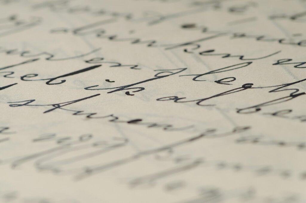
Cursive t writing, you may write more quickly and elegantly because the letters are joined in a fluid fashion. Unlike block or print letters, cursive emphasizes smooth, cursive t continuous strokes, which not only improve writing speed but also enhance the visual appeal of text. When learning cursive, mastering each letter is essential, as every letter has its unique shape, slant, and connection pattern. The letter T, in particular, plays an important role because it appears frequently in everyday words and has a distinctive form in both uppercase and lowercase styles.
Uppercase Cursive T
The uppercase cursive T is known for its graceful, looped, and flowing style Usually, it starts with a graceful upward curve that sweeps into a wide loop at the top and then smoothly descends. This creates a letterform that feels continuous and connected, unlike the print capital T, which is made up of straight, disconnected lines. In classic cursive, the uppercase T is more ornate, with larger loops and a more pronounced curve, giving it a decorative and formal appearance. In modern cursive, the design is often simplified—smaller loops, cleaner lines, and less flourish—making it easier to write quickly while still maintaining its cursive charm.
Lowercase Cursive t
The lowercase cursive t starts with a gentle upward loop from the baseline, followed by a straight or slightly curved downstroke, and ends with a small connecting tail that links smoothly to the next letter. This looping beginning is what makes it distinct from the printed “t,” which typically starts with a simple vertical line. In cursive, the crossbar of the lowercase t is placed after the main stroke is complete, and it sits slightly above the middle of the letter. The flowing nature of the cursive t allows it to connect seamlessly with letters before and after it, making handwriting faster and more fluid compared to its print counterpart.
Step-by-Step for Uppercase T
- Start with an upward stroke from the baseline – Place your pen on the writing line and sweep it upward in a smooth, diagonal curve.
- Curve over to form a large loop – At the top of the stroke, create a rounded loop that curves to the left, giving the letter its distinctive cursive elegance.
- Bring the stroke down with a slight curve – From the loop, draw a gentle downward stroke, letting it curve subtly to maintain the flow.
- Cross the letter in the middle or top, depending on the style – In more traditional cursive, the crossbar is placed high; in modern styles, it may be centered for simplicity.
Step-by-Step for Lowercase t
- Start with a light, slanted upward movement to set up the loop. This is the upward stroke from the baseline.
- Loop up and come down: Make a tiny loop at the top and then bring the stroke down to the baseline straight or slightly bent.
- Make a small tail for connecting to the next letter – Extend a short curve at the base to link smoothly with the following letter.
- Cross the “t” at the right height – Draw the crossbar slightly above the middle of the main stroke, ensuring it’s neat and proportionate to the letter’s size.
Common Mistakes to Avoid
When practicing the cursive T, it’s easy to develop small habits that affect the overall look and flow of your handwriting. Being aware of these common mistakes can help you correct them early:
- Making the loops too large or too small – Loops that are too big can make your writing look crowded, while very tiny loops can make the letter hard to distinguish. Make sure your loops are proportionate to the other letters in your cursive.
- Incorrect slant (should match other letters) – Cursive writing generally leans slightly to the right. If your T leans too far forward, too far back, or is completely upright, it will stand out awkwardly among other letters.
- Crossbar too low or too high – In both uppercase and lowercase T, the crossbar should be placed at the right height. A crossbar that’s too high looks unbalanced, and one that’s too low can cause the letter to lose its proper shape.
- Not keeping smooth connections to surrounding letters – One of the hallmarks of cursive is fluid connection. If your T starts or ends abruptly, leaving gaps or sharp angles, it breaks the flow and makes the handwriting look uneven.
5. Practice Tips
Mastering the cursive T takes patience and consistent practice. These tips will help you develop control, consistency, and confidence in your writing:
- Use lined paper for consistent slant and size – Lined paper provides a guide for keeping your letters uniform in height and maintaining a steady rightward slant. This is especially useful for keeping the loops and strokes of the T in proportion.
- Before connecting to words, practice the letters T and t separately. Concentrate on mastering the capital T and lowercase t first.
- Repetition helps build muscle memory, so the letter becomes natural to write without conscious effort.
- Write common words starting with T – Once comfortable, move on to full words such as Today, Time, and Trust. This helps you get used to starting words with a smooth, flowing uppercase T.
- Connect lowercase t with other letters smoothly – Practice words like cat, little, and letter, focusing on how the lowercase t transitions into and from surrounding letters. Smooth connections are key to fluid, elegant cursive handwriting.
6. Importance of Handwriting
The cursive T plays a valuable role in building strong handwriting skills and enhancing the visual appeal of written text:
- Cursive T helps develop muscle memory for smooth strokes – Practicing the loops, curves, and consistent slant of the cursive T trains your hand to move fluidly. Over time, these repeated motions strengthen fine motor skills and make all cursive writing faster and more natural.
- Looks elegant and is often used in signatures – The flowing form of the cursive T adds a touch of style to any piece of writing. Many people incorporate a decorative T into their signatures to make them more distinctive and visually appealing.
- Useful in calligraphy and creative lettering – Beyond everyday handwriting, the cursive T is an essential element in calligraphy and artistic lettering projects. Its graceful curves and adaptable style make it a favorite for invitations, logos, and decorative text.
7. Conclusion
Mastering the cursive T—both uppercase and lowercase—can significantly enhance the beauty, flow, and consistency of your handwriting. By learning its proper form, maintaining the correct slant, and ensuring smooth connections, you not only improve this individual letter but also develop skills that carry over to your entire cursive style.Consistent daily practice is the key to success. Even a few minutes each day spent writing the cursive T in isolation and within words can build confidence and muscle memory, turning careful strokes into effortless, elegant writing.
8. Optional Additions
To make learning and understanding the cursive T more engaging and effective, you can include the following enhancements in your study material or article:
- Visual Examples: Diagrams for uppercase and lowercase T – Providing step-by-step illustrations of both uppercase and lowercase cursive T helps learners visualize the starting points, loops, and connections. Arrows and numbered steps in diagrams can make the writing process clearer and easier to follow.
- Comparison Table: Cursive T vs. Print T – A side-by-side comparison highlights the key differences in shape, style, and flow between cursive and print versions of the letter T. This enables students to recognize the distinctive beauty and interconnectedness of cursive writing.
- History Section: Origin of the cursive T style in English handwriting – Adding historical context can make the lesson more interesting. The cursive T, like many cursive letters, evolved from 16th- and 17th-century English penmanship styles, influenced by the Spencerian and later Palmer methods. These writing systems emphasized smooth, continuous strokes for efficiency and beauty, shaping the cursive T we use today.